.svg)
Redesigning Paymob’s Android POS experience
I led the end-to-end redesign of Paymob’s Android payment terminal application, one of the company’s earliest and most widely adopted products.
Paymob is a fintech company operating across the MENA region, enabling businesses to accept digital payments both online and through in-store Android payment terminals. At the time of this project, over 200,000 live POS devices were active in the market.
Originally built to support simple card transactions, the POS had gradually evolved into a multi-service financial tool. Merchants could now accept alternative payment methods, offer BNPL, generate QR-based payment links, and access additional Paymob services such as lending and account management.
However, while the product’s capabilities expanded significantly, the experience and interface did not evolve at the same pace.
So the goal of this project was to:
As Paymob’s POS evolved and new capabilities were added to the interface over time, structural and usability issues emerged that impacted the overall merchant experience.
I conducted direct product testing and audited the key flows, and together with merchant feedbacks gathered in-market by Paymob’s field team, we identified the issues into these major themes:
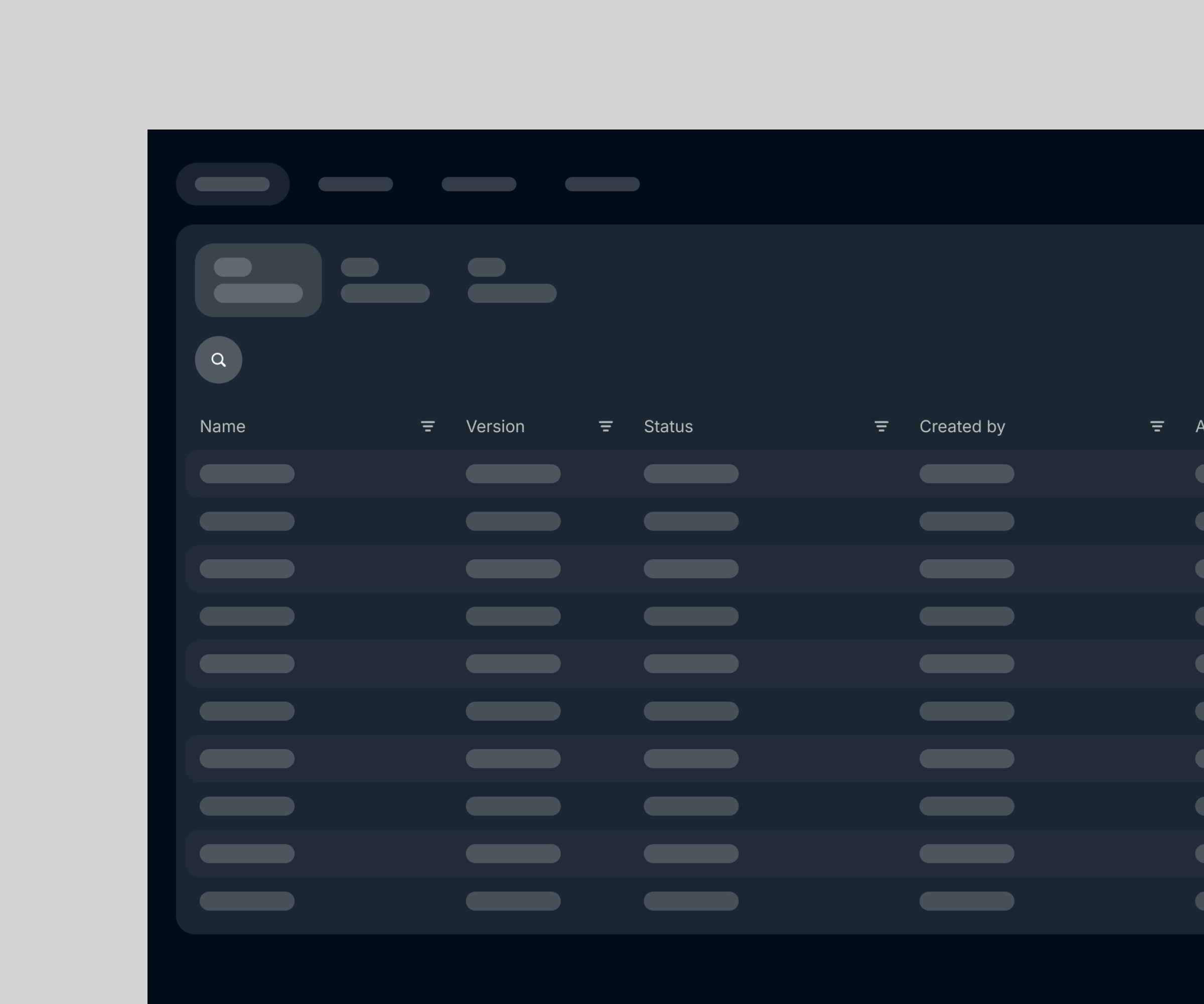
With the expansion of alternative payment methods, BNPL integrations, QR payments, and financial services, the information architecture was not restructured to accommodate growth.
As a result:
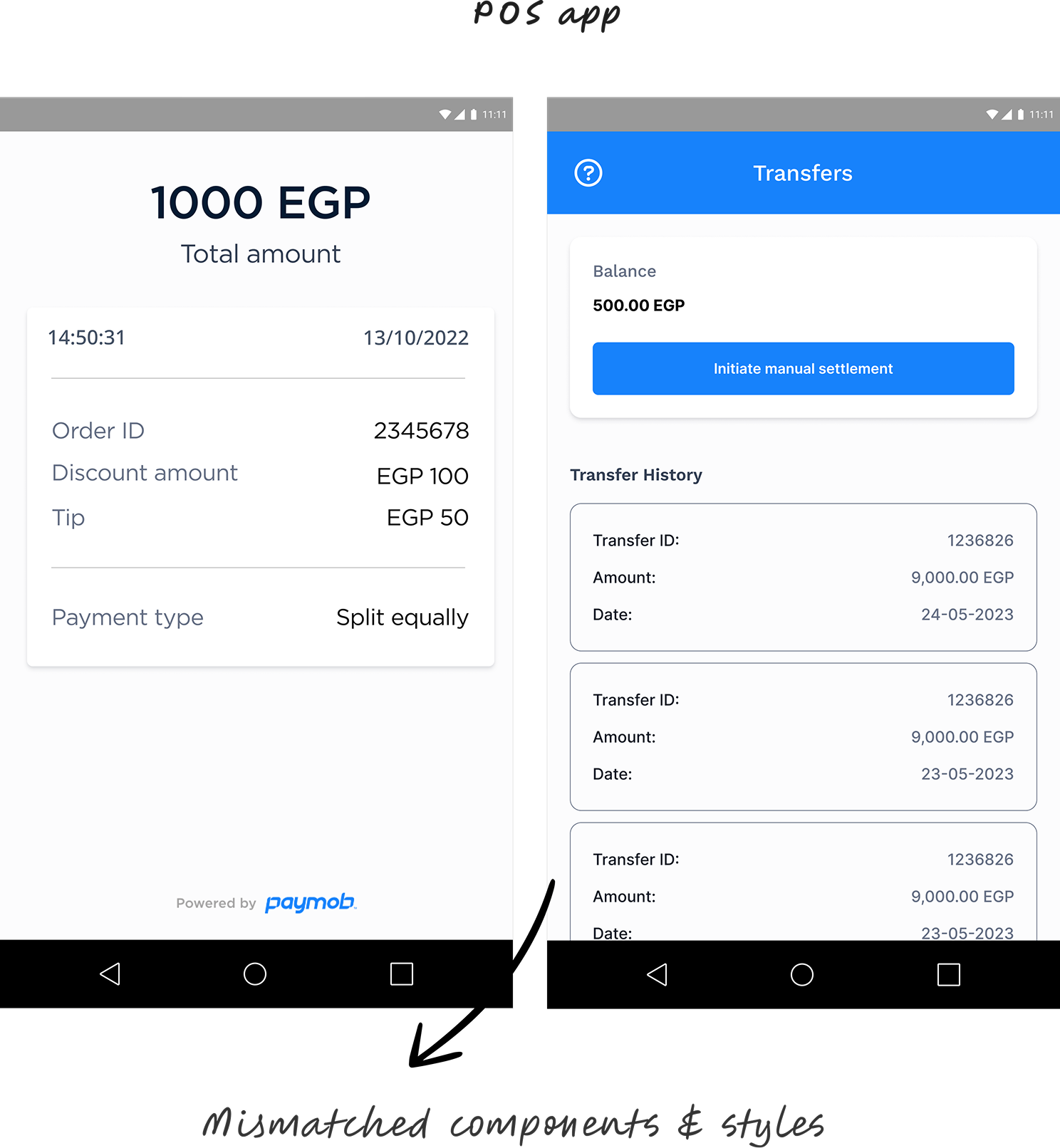
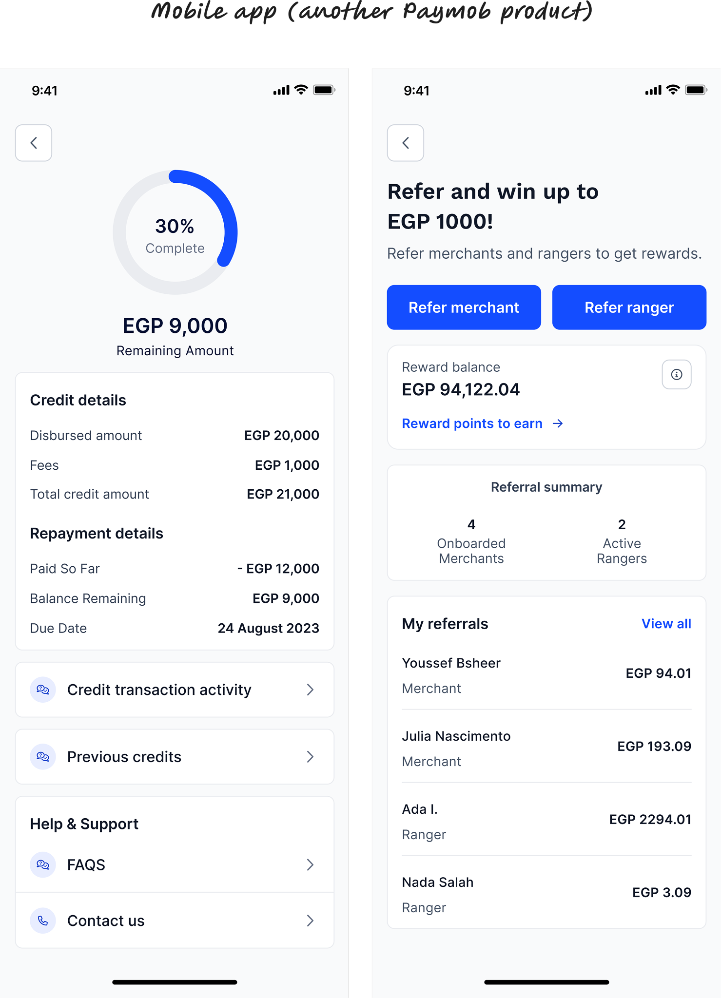
Paymob had updated its brand identity, including colours, components, and visual style across its mobile and web products. However, these updates were never reflected in the POS interface.
As a result, the POS experience felt visually disconnected and outdated compared to other Paymob product ecosystem.
This led to:
Below is a comparison between the POS interface and Paymob’s mobile app.
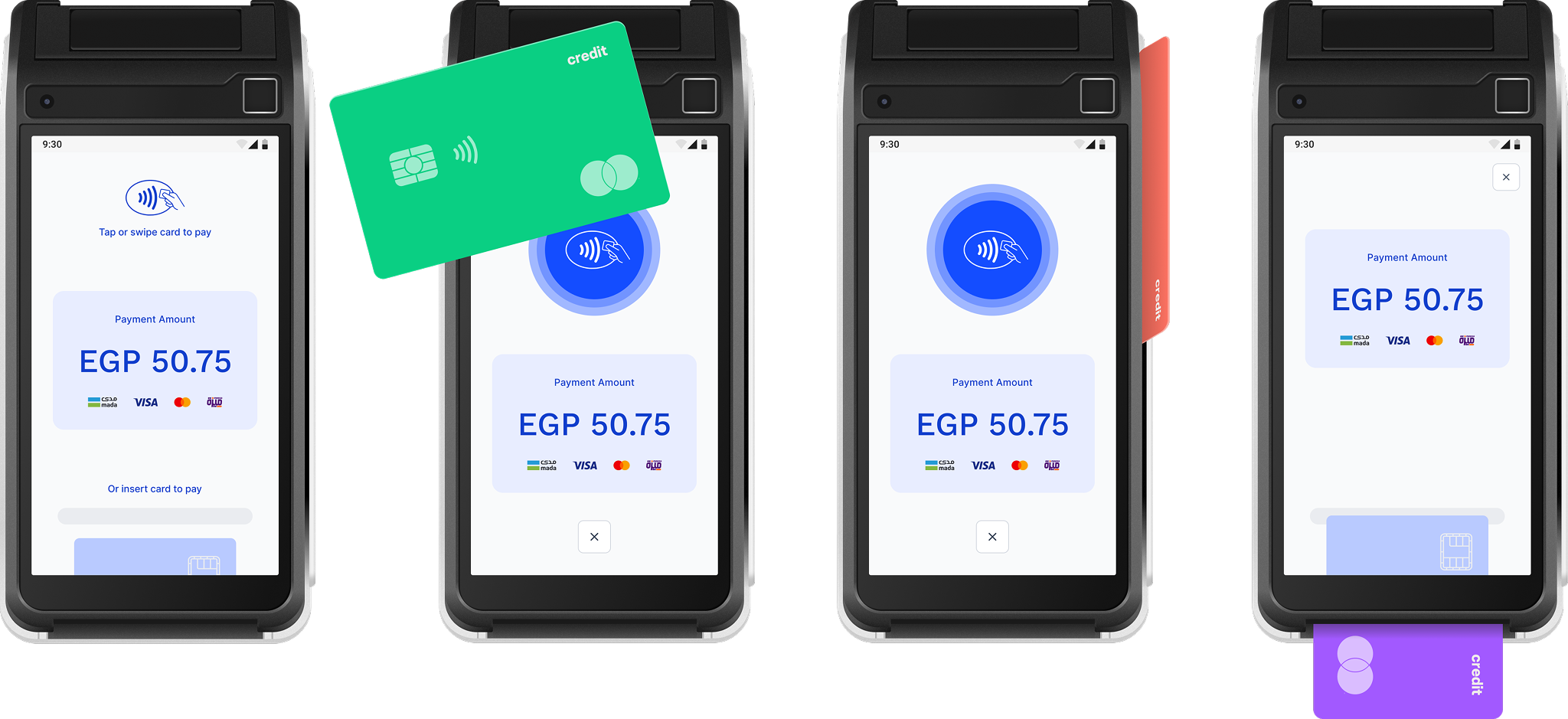
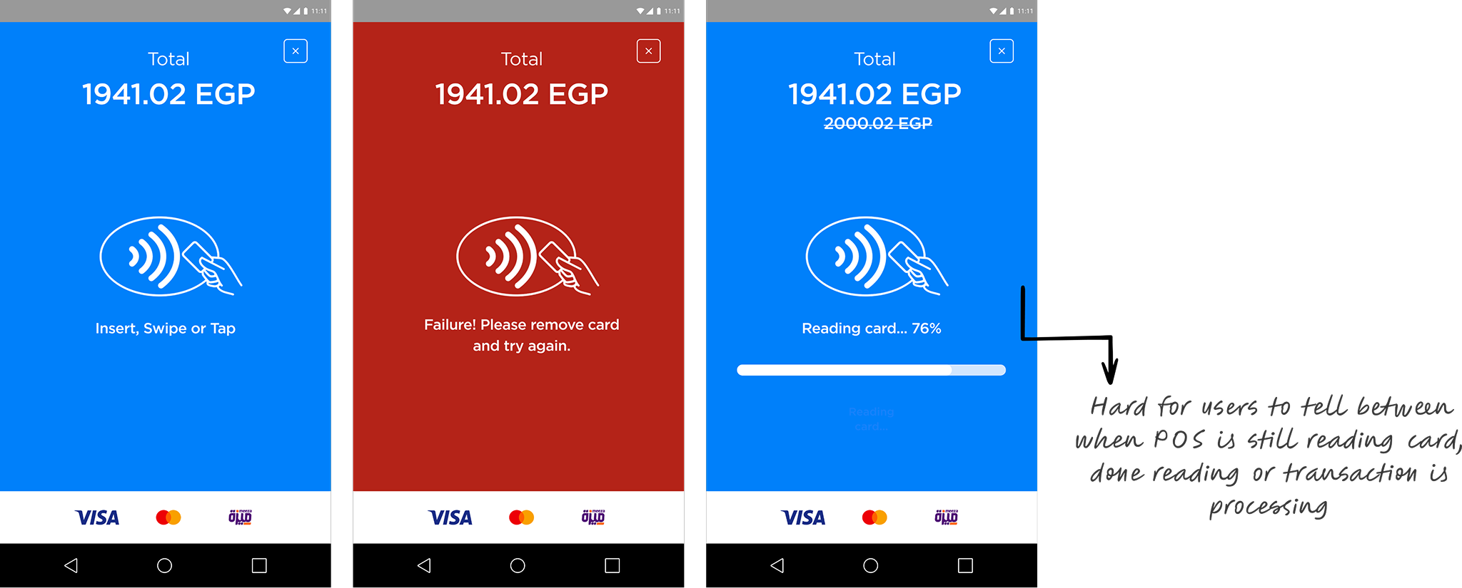
Testing revealed that card transactions took approximately 10 seconds to complete.
Beyond the raw processing time, the experience lacked clear feedback during the loading state. Once a merchant or their customer tapped a card, there was minimal indication of progress, leading to uncertainty and hesitation.
This created:
With all the insights gathered so far, I began the redesign.
To address the issues, I focused my redesign on these core pillars:
I conducted a full feature audit of the POS and reorganized all actions and services into clearer task-based categories to define a scalable information architecture.
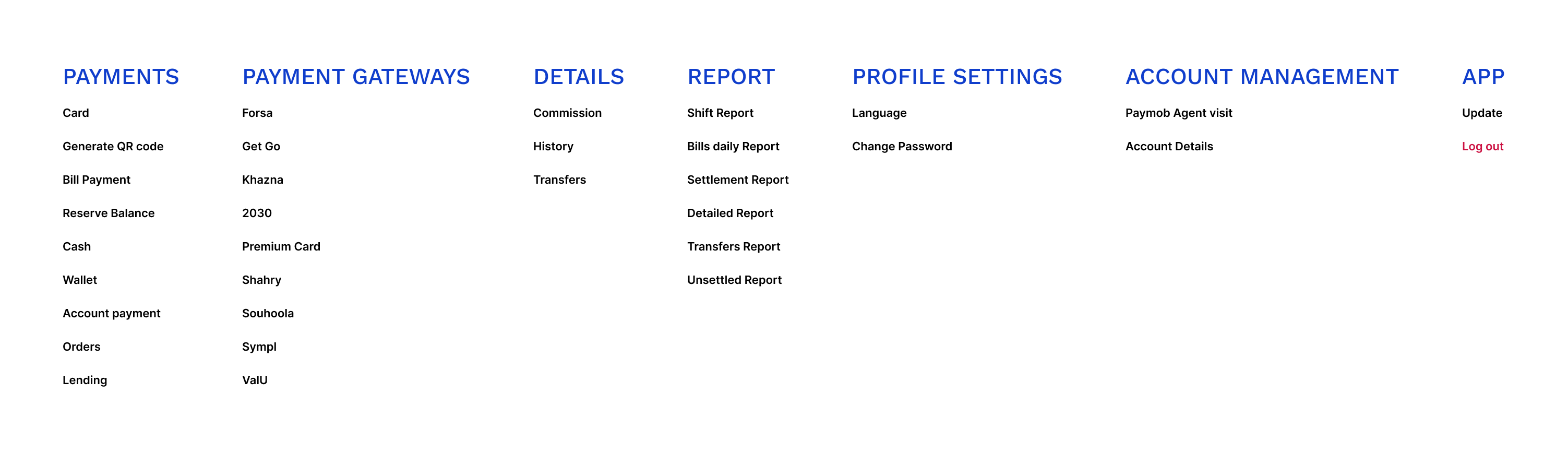
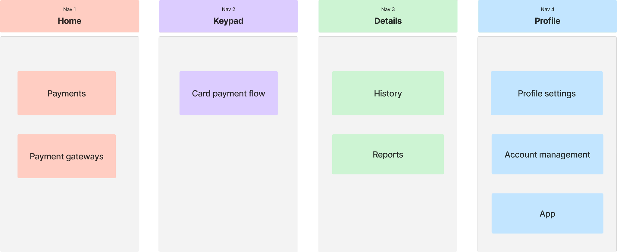
Then I regrouped those categories based on how they will fit in the new navigation
Although this is technically an Android app, it is primarily a POS tool used by cashiers in fast-paced, real-world checkout environments.
That reality shaped my design decisions from the start.
So I had to account for the fact that:
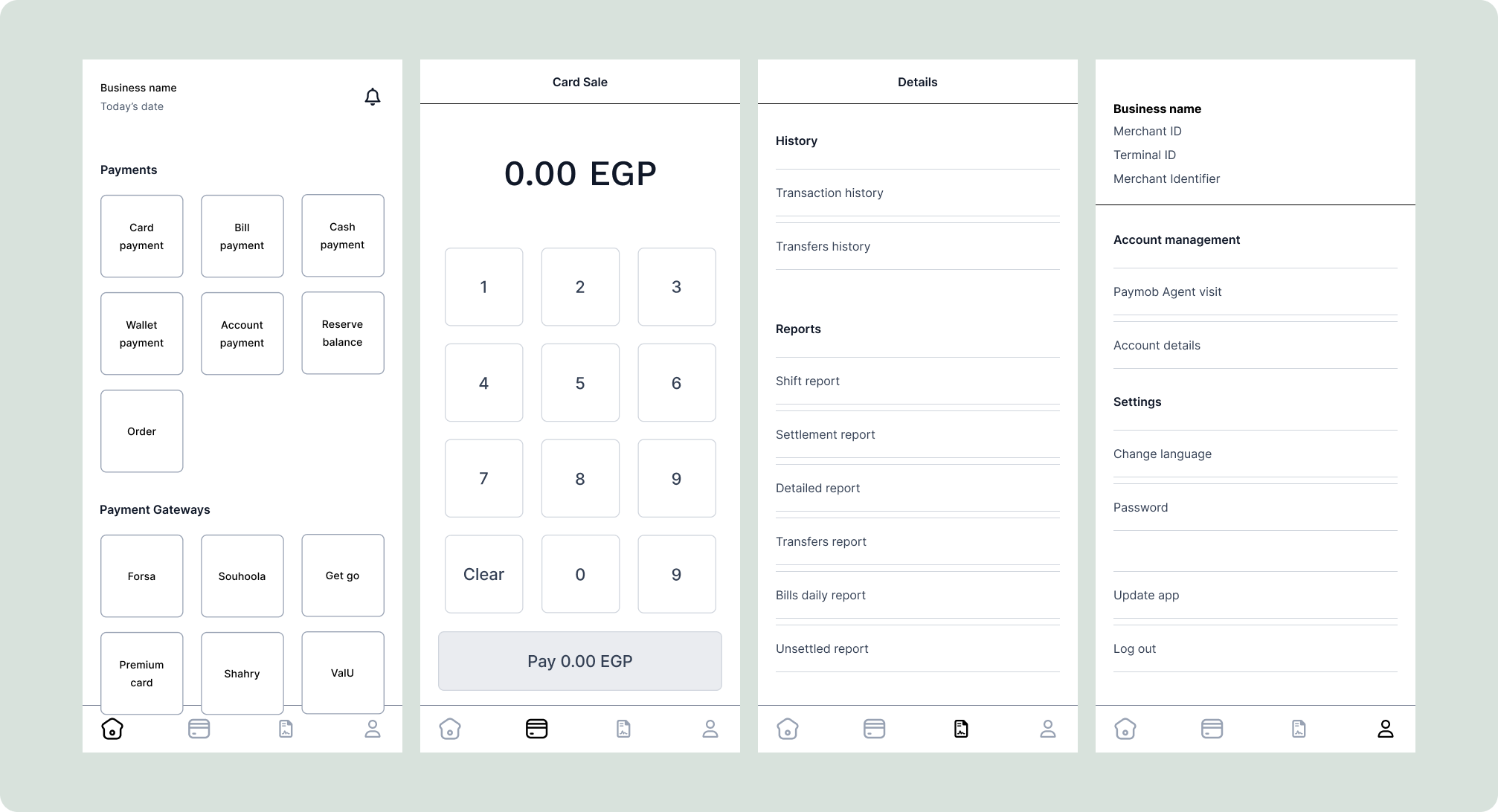
With these constraints in mind, I created low-fidelity wireframes for the new information architecture and core card payment flow to align stakeholders on the proposed direction. I then built interactive prototypes that field agents tested with selected merchants to validate the approach early.
Here are the primary screens:
Feedback on the proposed structure and flows was positive, so I moved forward into high-fidelity design.
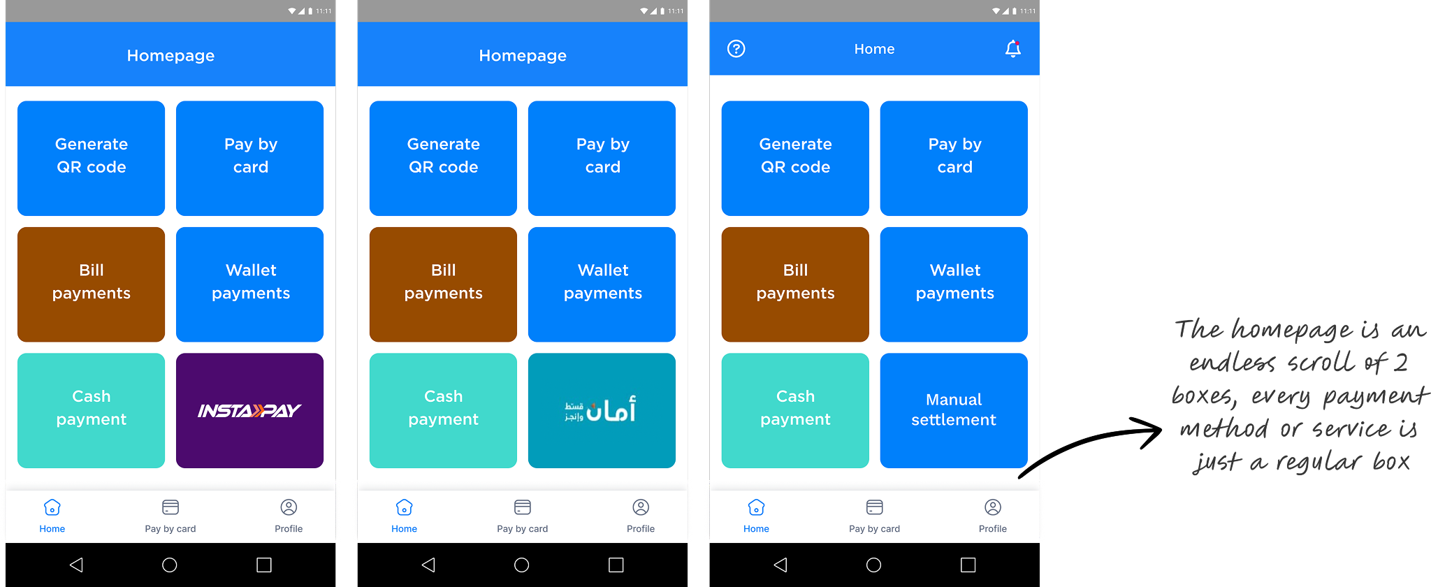
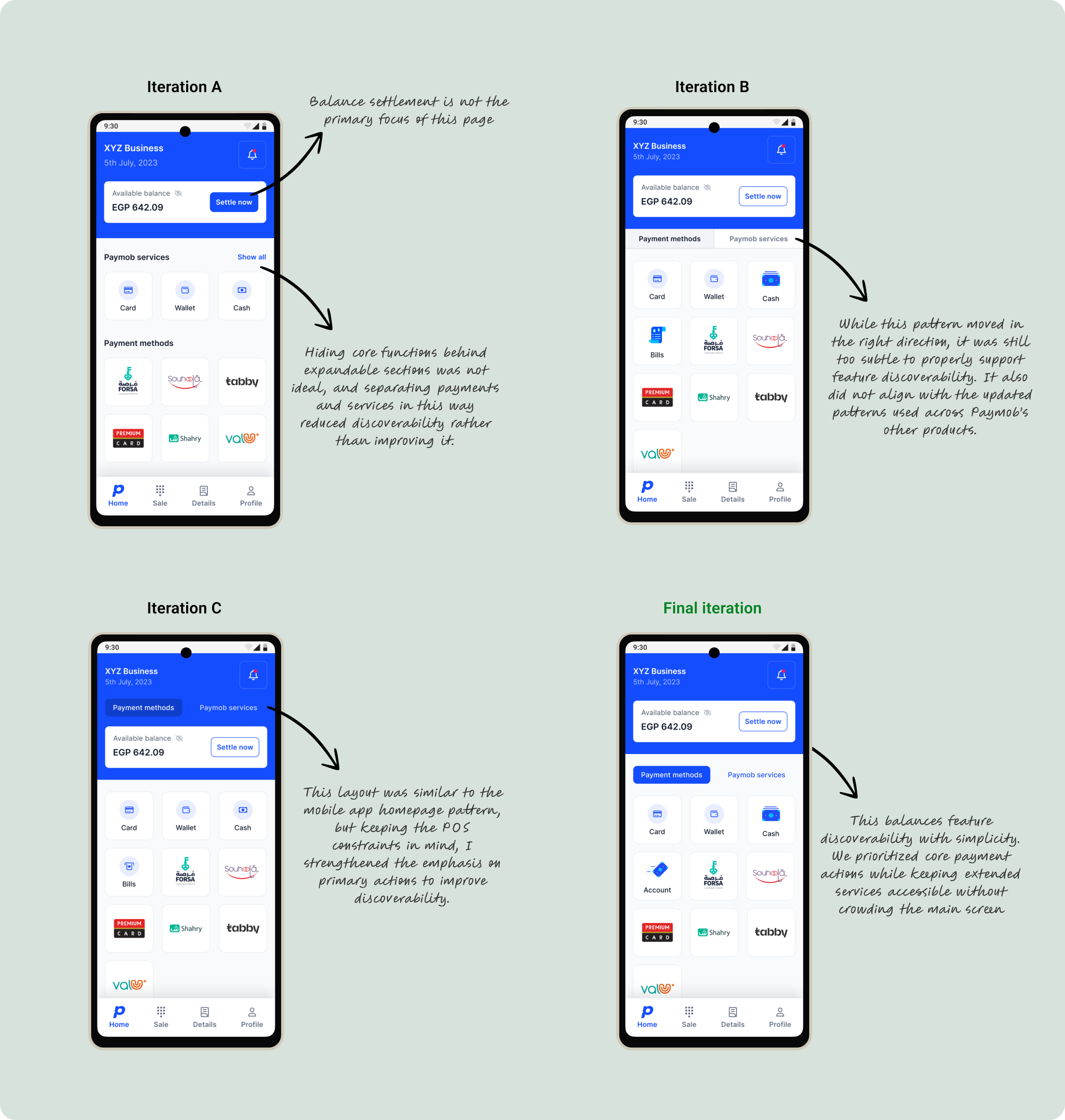
During alignment, we refined the homepage structure by merging Payments and Payment Gateways into a single Payments entry point, and grouping other Paymob merchant services, such as lending, separately. This improved discoverability while keeping the navigation simple.
I explored multiple homepage layout iterations and referenced patterns from Paymob’s mobile app to maintain ecosystem consistency, while adapting the layout for POS usage needs.
Note: I collaborated with the brand identity team to develop custom illustrations and animations for key features. Some screens shown use interim flat icons where final illustrated assets were still in progress.
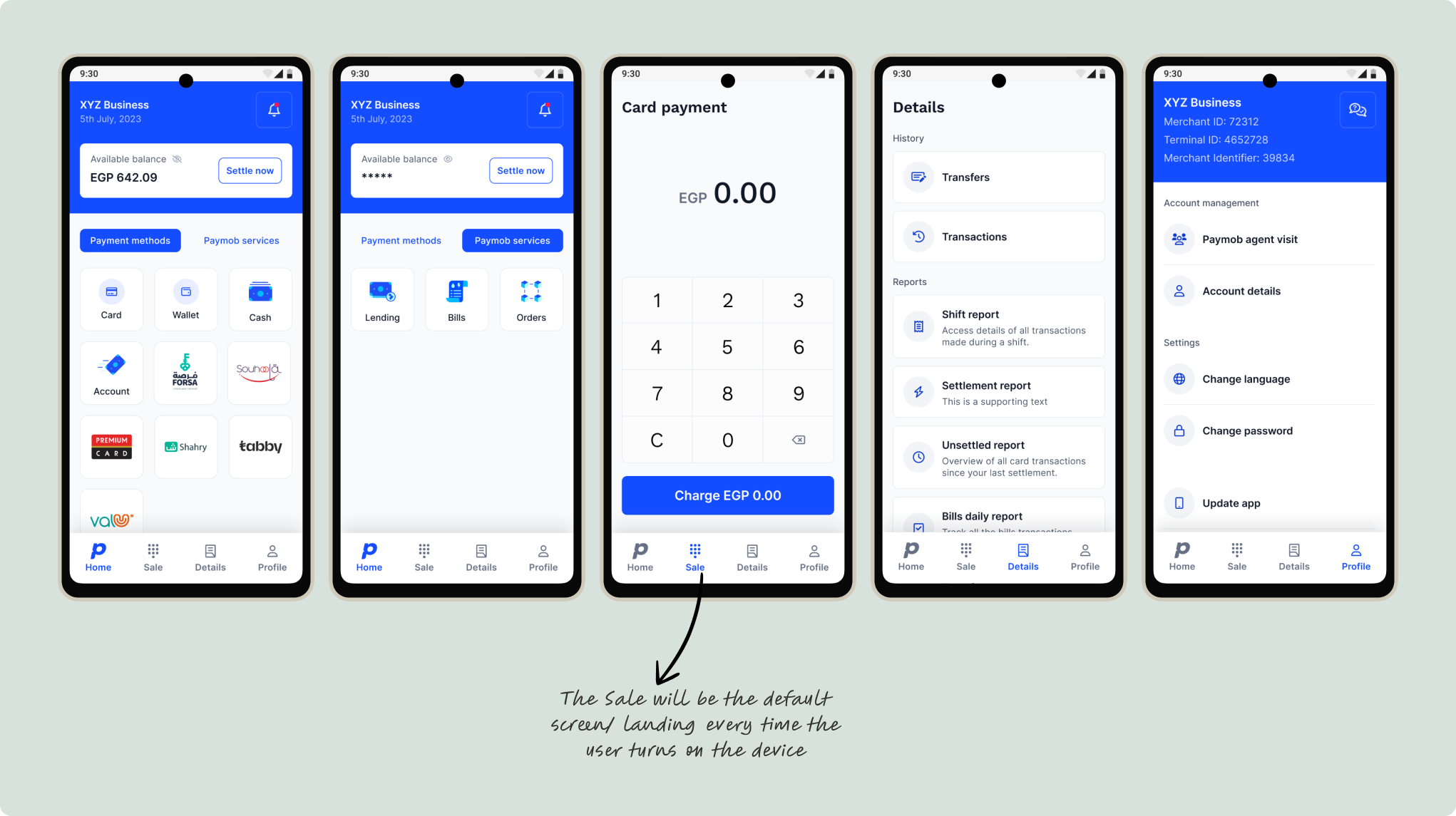
Here are the remaining key high-fidelity screens across the main navigation sections.
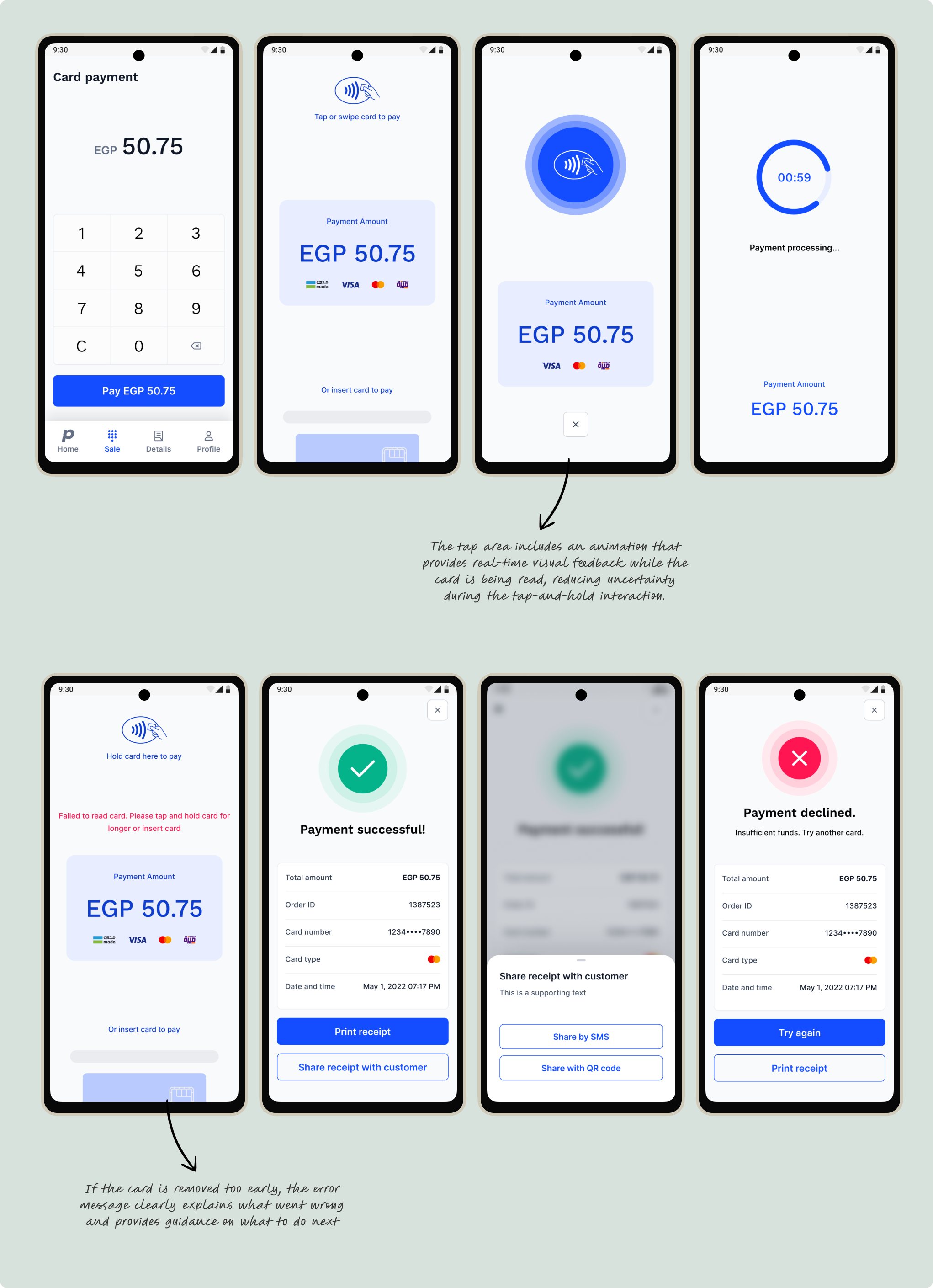
Based on the transaction feedback and processing gaps identified earlier, I focused on redesigning the processing experience and reducing both actual and perceived wait time.
I worked closely with engineering to pair clearer UI feedback with backend performance improvements. I also made card payment the default landing screen to support the most common POS action and remove an extra navigation step.
Key improvements:
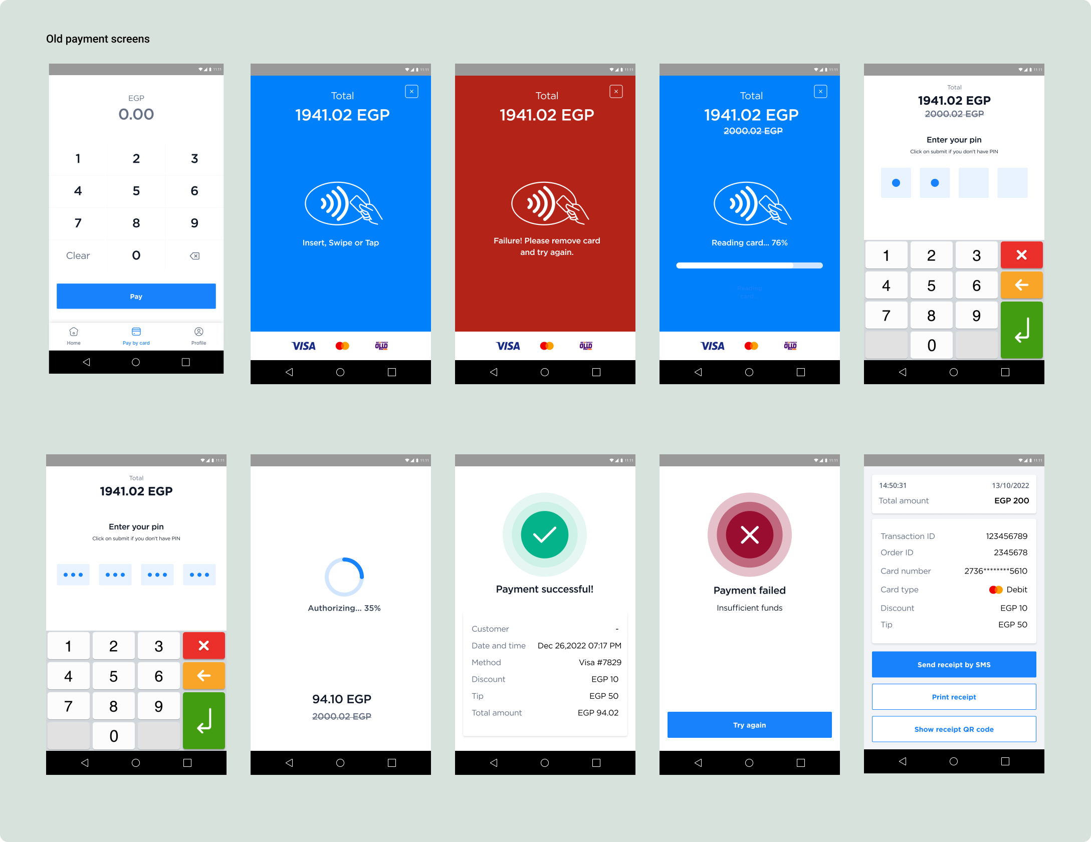
Here's a glimpse into the old card payment flow:
I restructured the transaction journey into three distinct flows to better reflect real-world payment behavior:
This allowed clearer state transitions and specific feedback per interaction.
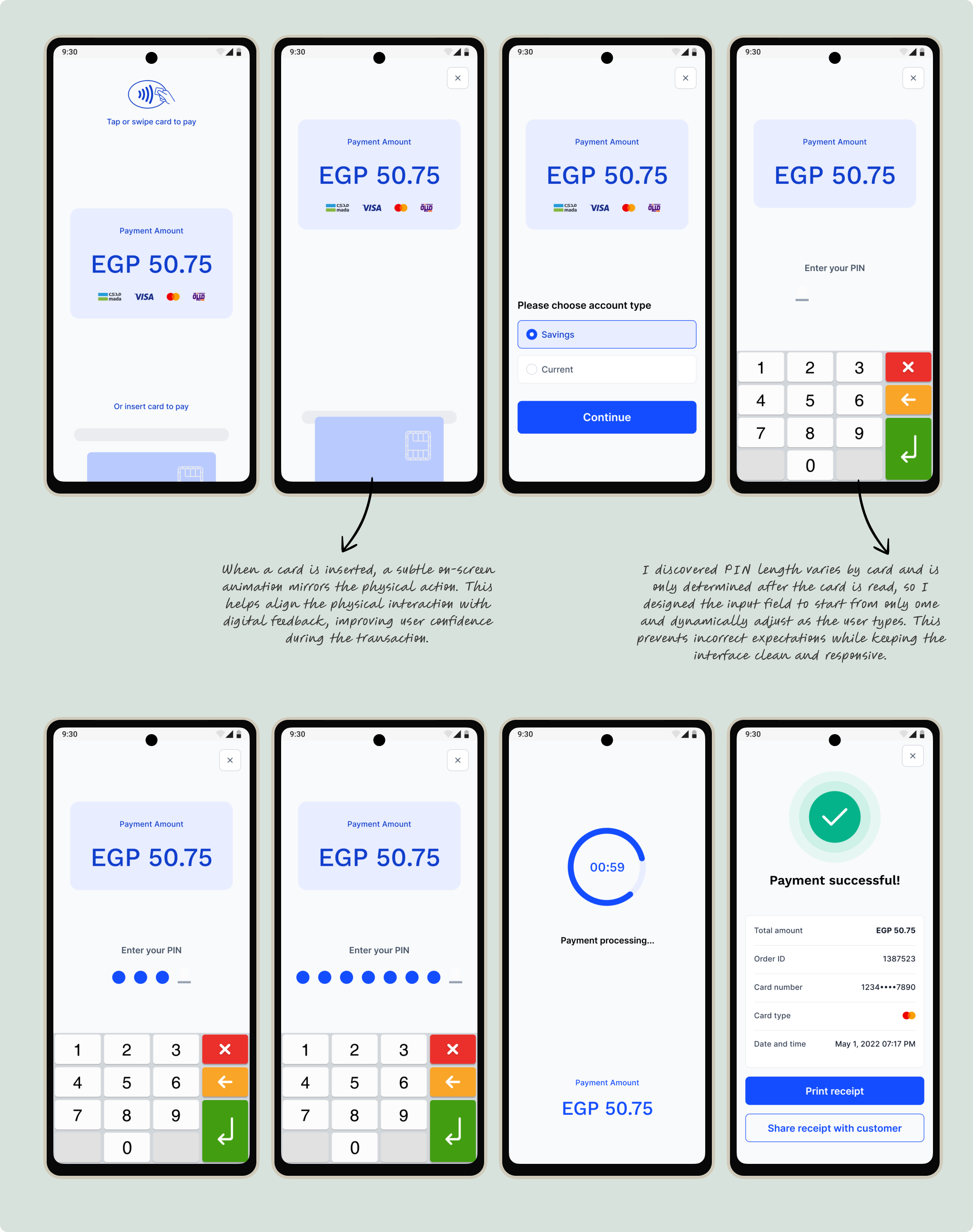
After reviewing the transaction flow with engineering, I explored how we could further simplify the experience.
We decided to merge the card reading and processing states into a single unified flow to reduce perceived wait time and create a smoother interaction.
Working closely with the brand team, we implemented the updated animation using the Paymob logo to create a more cohesive and branded experience.
Below is the demo we shared internally to validate this approach, followed by the insert-card animation mentioned earlier.
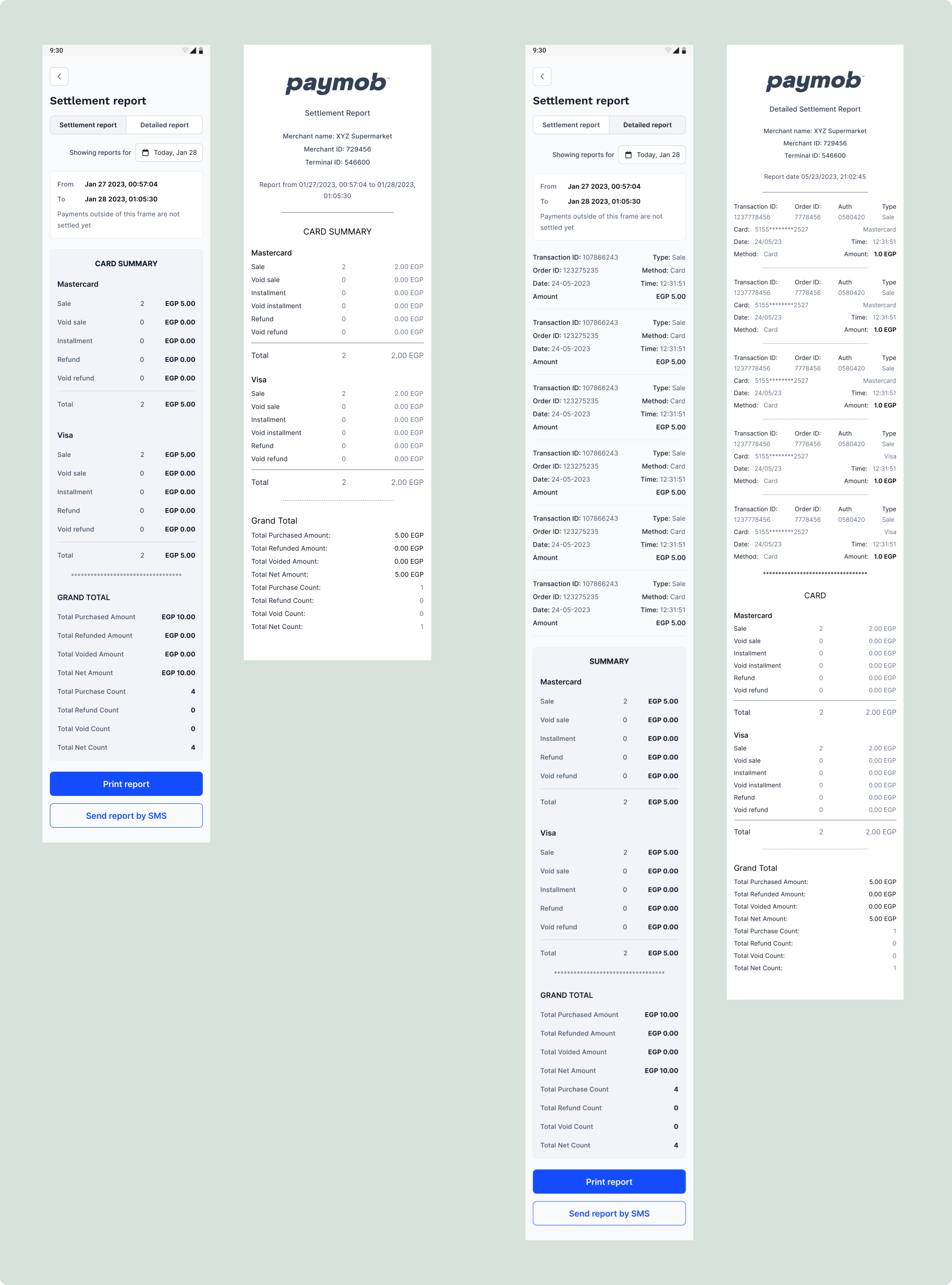
Beyond the core payment flows, I extended the updated design system across supporting merchant tools, including reports, histories, and receipt generation.
These screens reinforced layout consistency, component standardization, and alignment with Paymob’s updated brand identity.
Below is a sample of the Settlement Report layout and its corresponding printable receipt. The same design principles were applied consistently across all reporting and transaction records.
Note: Due to the length of the report screens, they are displayed without device frames to show the full layout.
The redesigned POS experience delivered measurable improvements across performance, usability, and product perception following launch.
With the rollout across live devices, these improvements scaled across Paymob’s active terminal network in the market.
Key outcomes:
This project transformed the POS from a feature-expanded legacy tool into a scalable, performance-driven financial platform.
This project reinforced that in POS environments, clarity and speed are not aesthetic preferences, they are operational requirements. Designing for constrained hardware, high-pressure checkout contexts, and non-technical users requires reducing ambiguity at every step.
I also learned that perceived speed can be just as important as actual performance. By aligning UI feedback with backend improvements, design and engineering together transformed how the product felt in real use.
Designing for scale in live devices pushed me to think beyond screens and into systems.